1stSeptember, 2026
How to Choose a Balloon Colour Palette That Looks Professionally Designed
Colour is usually the first detail a client chooses and the element most likely to determine whether balloon décor feels refined or random. Professional palettes are not simply lists of favourite shades. They are systems: one colour leads, supporting tones create depth, and finishes control how light moves across the installation.
Start with the fixed elements
Before selecting balloon colours, identify what cannot change. Venue carpet, wall colour, chairs, linens, floral arrangements, corporate logos and wedding party attire all influence the palette. A beautiful dusty rose may look unexpectedly brown against warm ballroom lighting; a cool white balloon may appear blue beside ivory linens.
Collect photographs of the venue and key materials in one place. If exact matching matters, request physical samples. Screens are useful for direction, but brightness settings and photo filters make them unreliable for final approval.
Use a dominant, supporting and accent structure
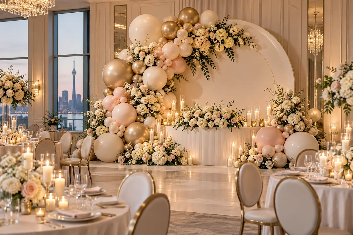
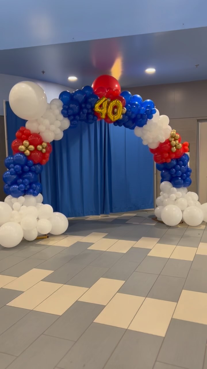
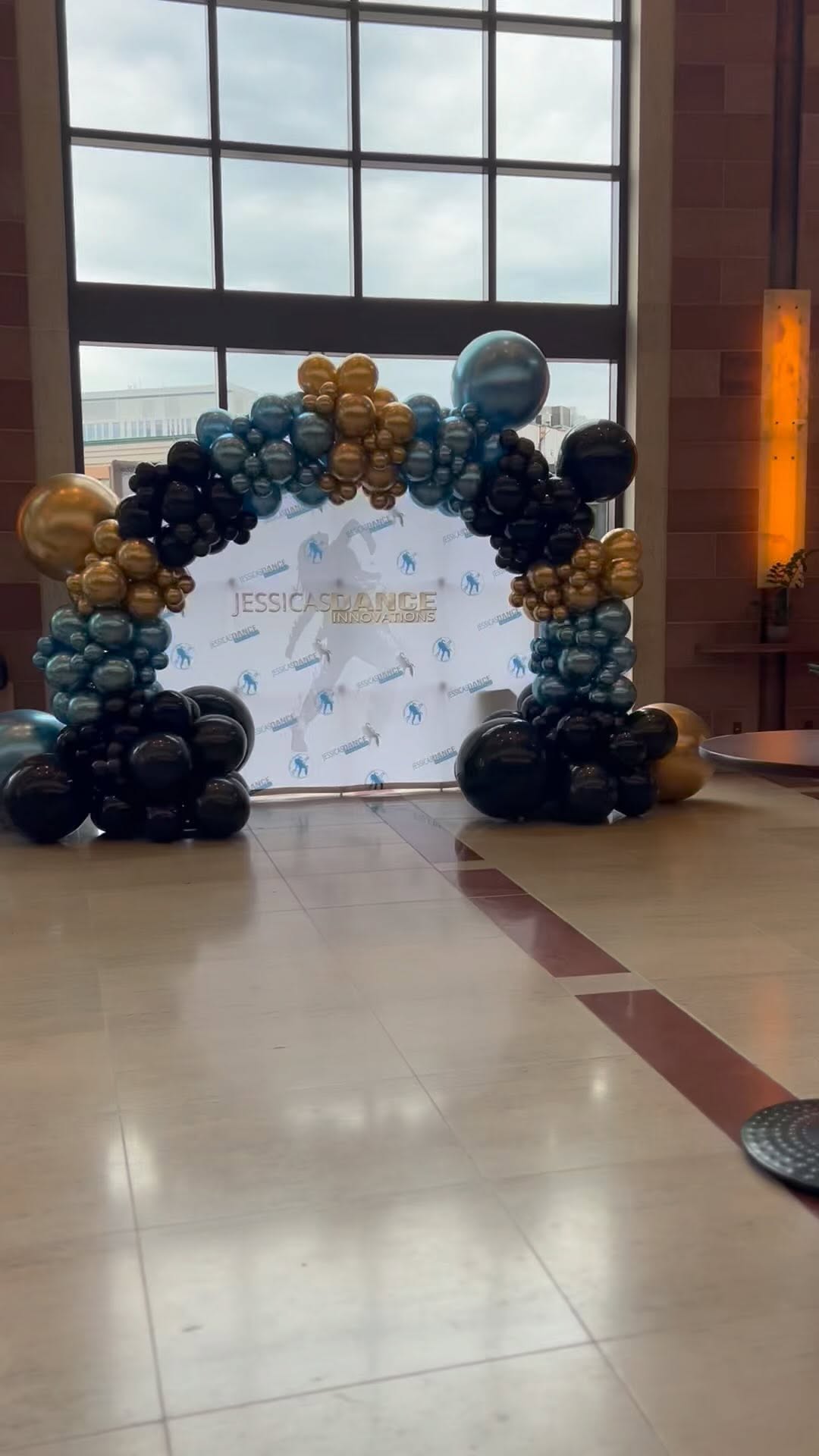
A practical starting point is roughly 60 percent dominant colour, 30 percent supporting colour and 10 percent accent. This is not a rigid formula; it is a way to prevent every shade from competing equally. A wedding palette might use ivory as the dominant tone, taupe as support and champagne chrome as the accent. A children’s party can use the same hierarchy with far brighter colours.
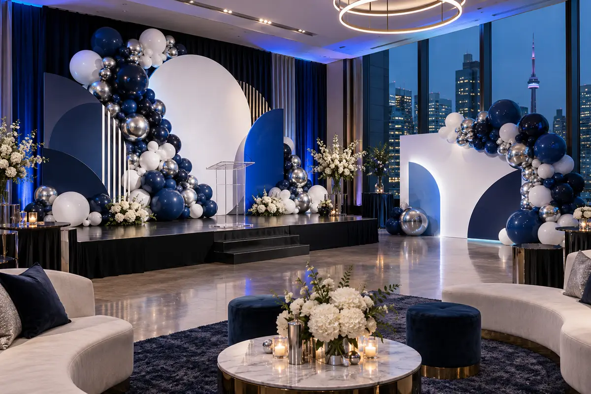
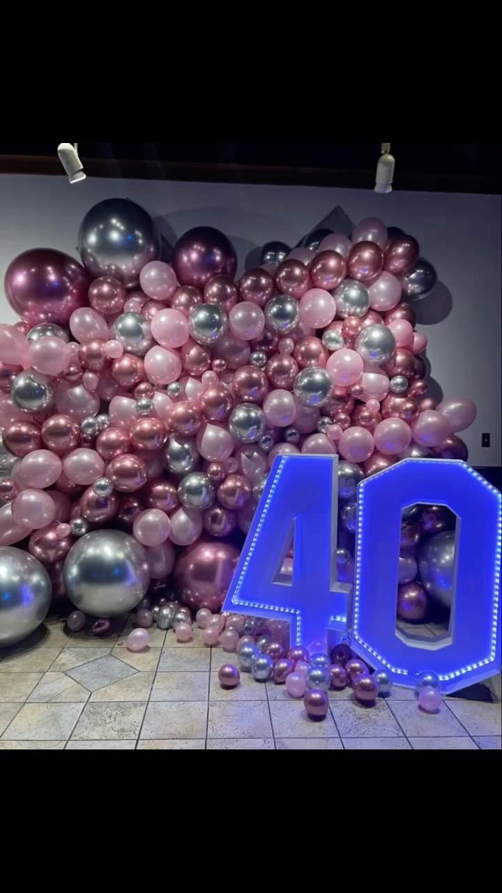
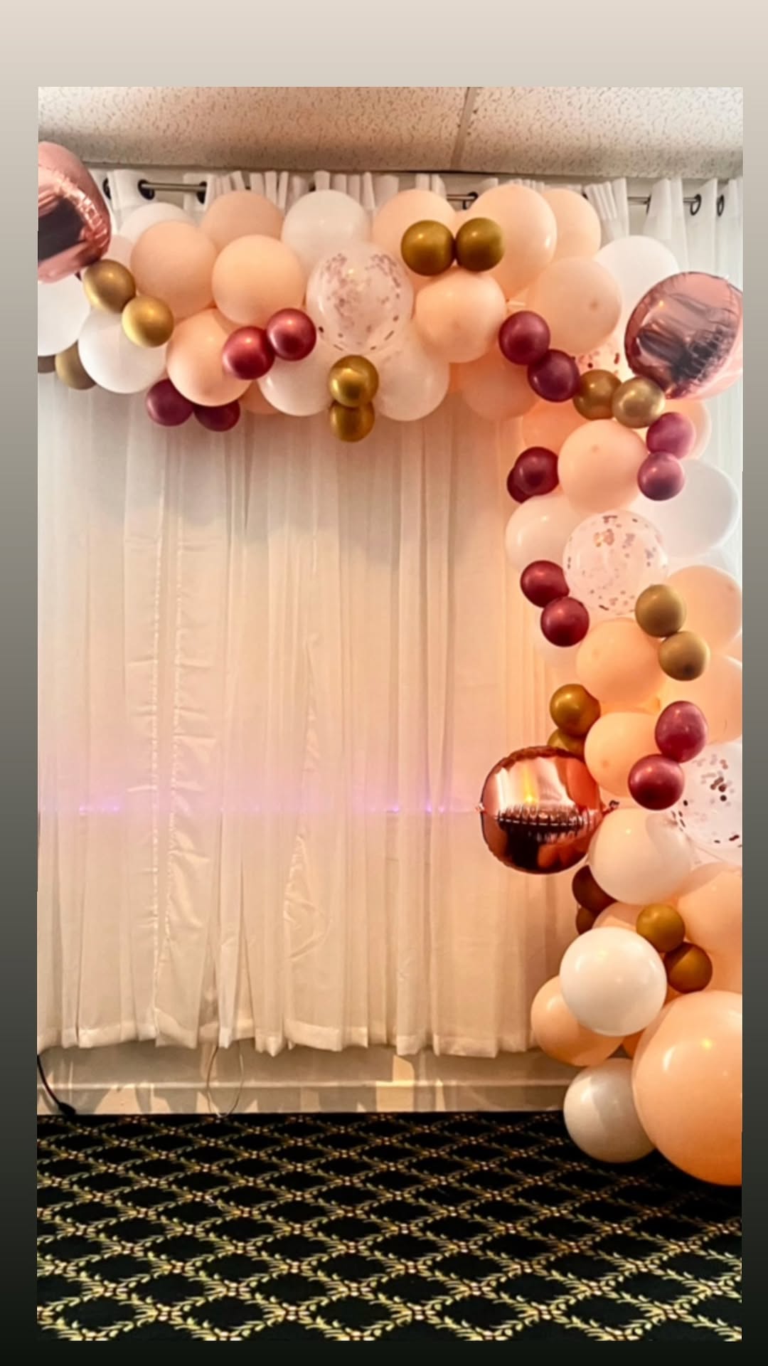
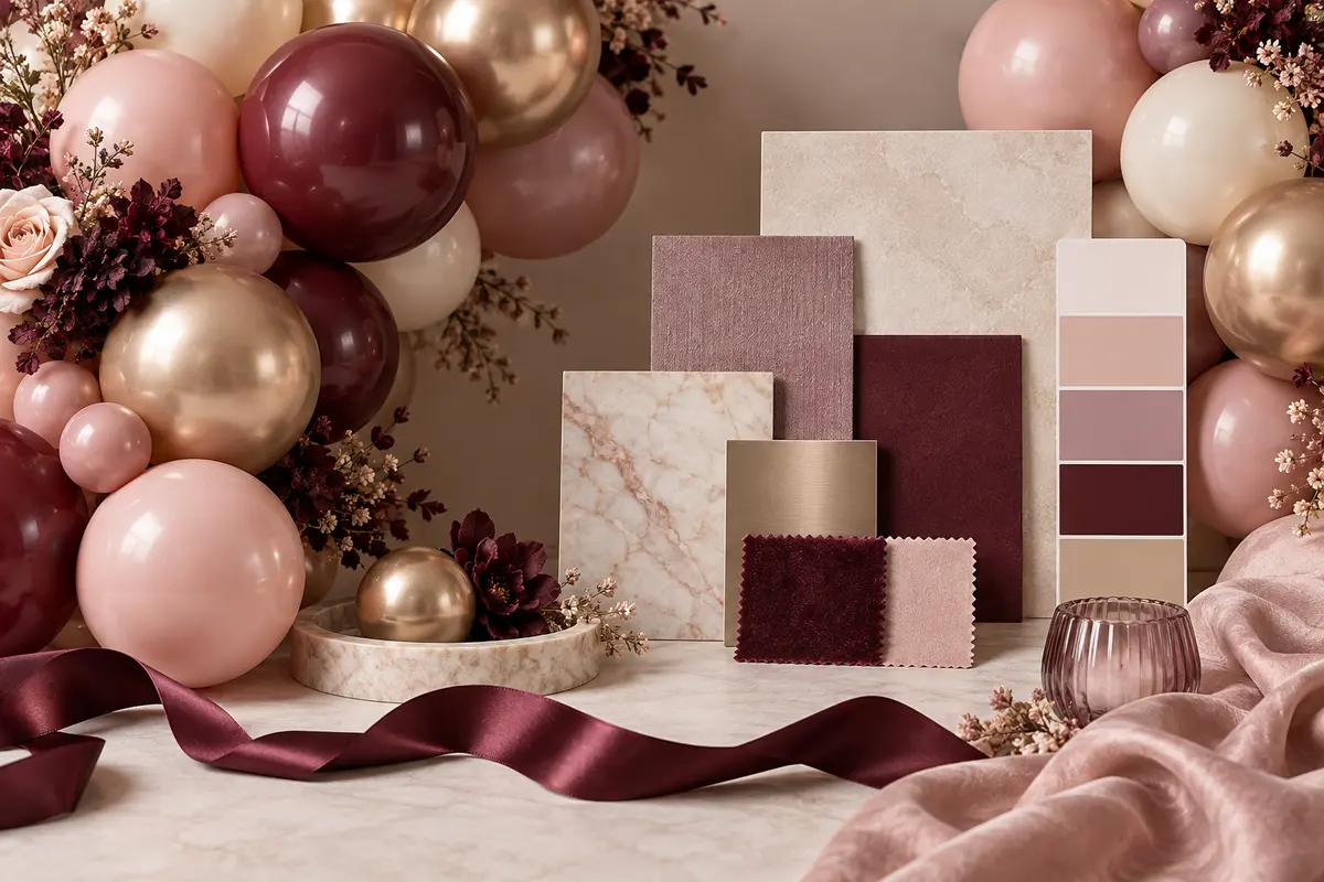
For a monochromatic installation, vary value and finish rather than adding unrelated hues. Blush, rose and burgundy can feel layered because they belong to one family. Matte, pearl and metallic versions of similar colours create additional depth.
Understand undertones
Two balloons can both be described as beige while one leans yellow and the other leans pink. Place neighbouring shades together under neutral light and compare them to the event’s fabrics or printed materials. When undertones agree, even a complex palette feels calm. When they clash, the installation can feel off without an obvious reason.
“A sophisticated palette is often more about editing than adding.”
GTA Balloons Design Team
Colour & StylingDesign for lighting and photography
Natural light reveals subtle colour differences; warm indoor light compresses them. Highly reflective chrome balloons can become bright highlights in photographs, while matte surfaces read more evenly. If the room uses coloured uplighting, ask to see the lighting plan. Purple light over champagne and blush décor can change the entire palette.
Contrast also matters for practical information. If a welcome sign sits inside the display, the lettering must remain readable. Ontario accessibility guidance recommends considering colour contrast when presenting information. A visually beautiful sign has failed if guests cannot read the names, seating direction or event message.
Avoid the most common palette mistakes
- Do not select five equally strong colours without deciding which one leads.
- Do not approve colour from a heavily filtered inspiration photo.
- Do not assume every product with the same colour name has the same undertone.
- Do not add metallics everywhere; use them where you want the eye to land.
- Do not forget the venue’s walls, flooring and lighting.
Build a palette brief your decorator can use
Provide the event type, venue photos, invitation or logo, linen colour, floral plan and three words describing the mood. “Modern, warm and editorial” gives better direction than “neutral.” The designer can then recommend specific balloons and finishes that deliver the feeling rather than merely copying a swatch.
Further reading: Ontario’s guidance on making information accessible includes practical considerations for clear visual communication.
Colour should make the installation feel connected to the celebration. With a clear hierarchy, compatible undertones and careful attention to light, even a restrained palette can create extraordinary impact.
A polished palette begins with restraint. Choose one leading colour, support it with complementary tones and review every finish in the lighting of the actual venue.